Project Details
Dive into the creative process behind each design.
A Creative Business Site
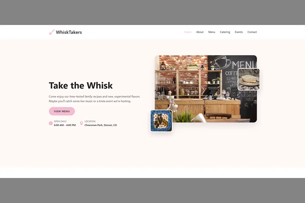
WhiskTakers is a fictional cafe located in Denver, CO. I created it as part of a class assignment to develop a webpage for a real or fictional business.
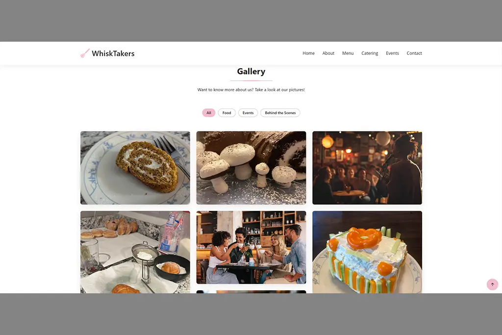
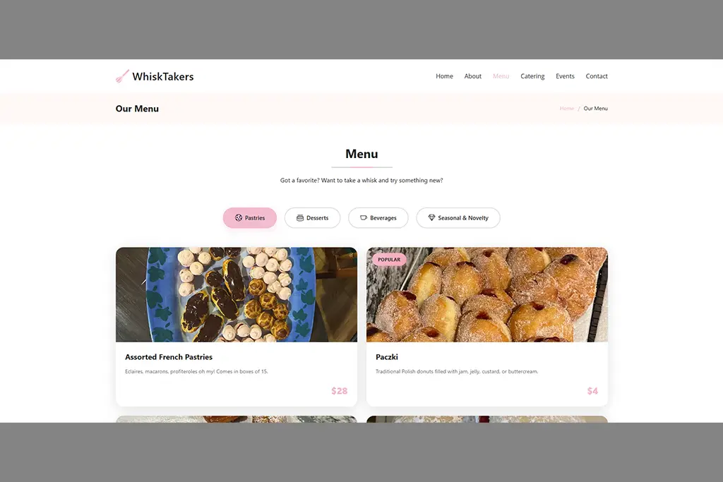
Using a Bootstrap template, I had to significantly change the site to represent my chosen business. This includes changing images, color palettes, fonts, icons, videos, and text. Additionally, I included SEO tools like Google Analytics, PageSpeed, and meta-tag descriptions and keywords.
Since I was developing a site for a fictional business, I not only had to design the site itself, but also develop a brand identity for WhiskTakers.
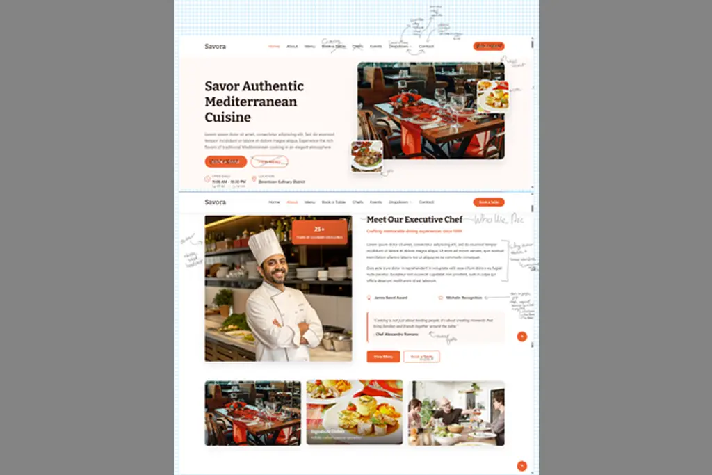
Using BootstrapMade template Savora, I developed a site that is fully operational for the cafe. I created a brand identity for WhiskTakers, a community-driven local cafe that serves classic family recipes alongside more unique treats to try. Keep scrolling for an in-depth walk-through of my process.
Key Features
- Google Analytics
- Optimized Content
- Responsive Web Design
- Easy and Intuitive Navigation
- Meta-Tags and Keywords


Step 1
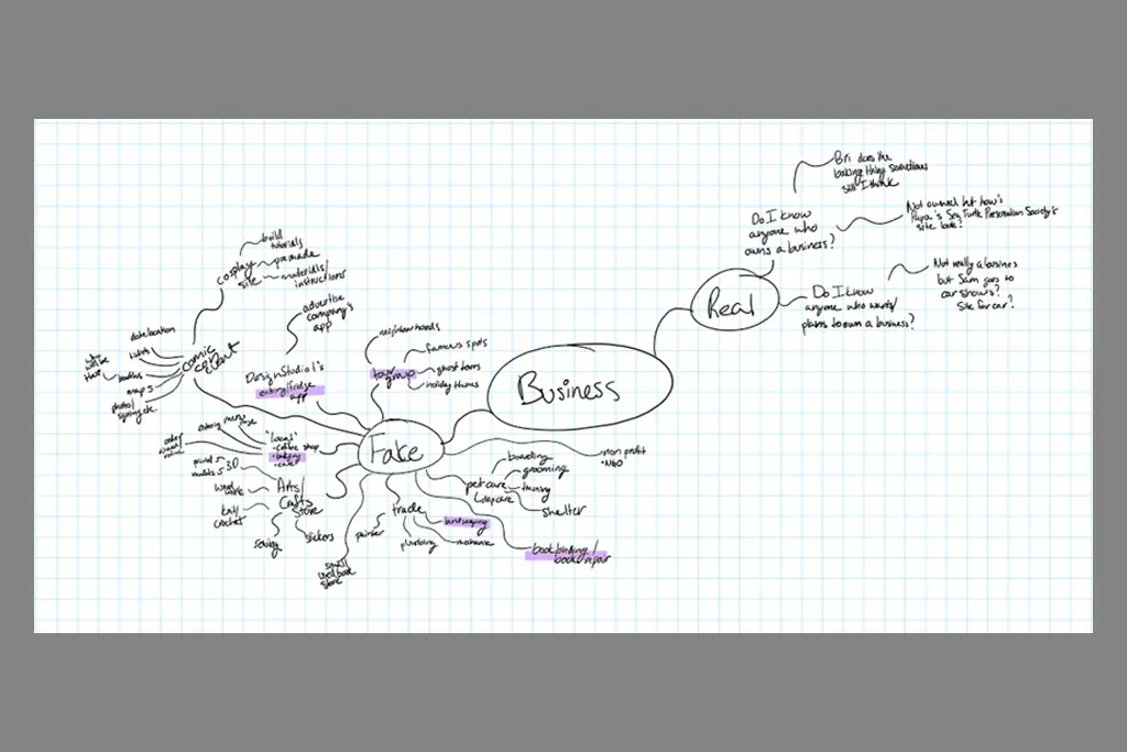
First, I had to come up with an idea for the business. I began by brainstorming some businesses I would be interested in designing a site for. Once I got a decent list going, I had to narrow it down. Highlighted in purple were my top five ideas.
From there I dug deeper into each, interrogating what initial concepts I envisioned for each potential site and perform from rough sketches with a template.
Step 2
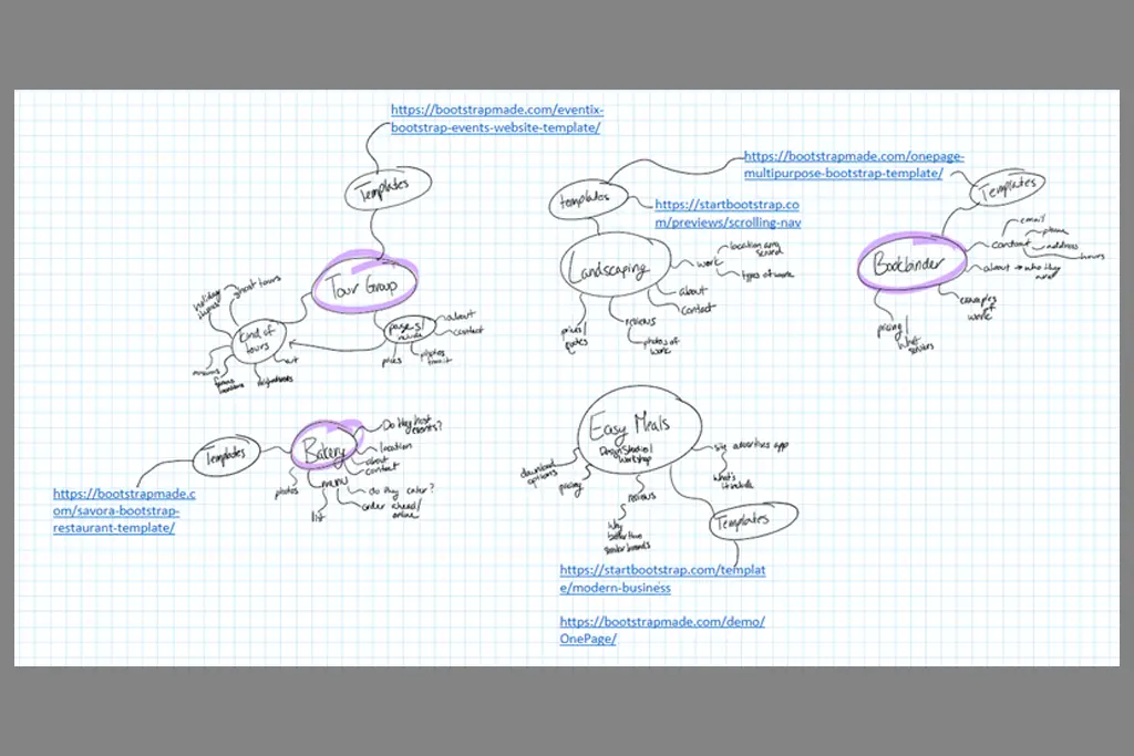
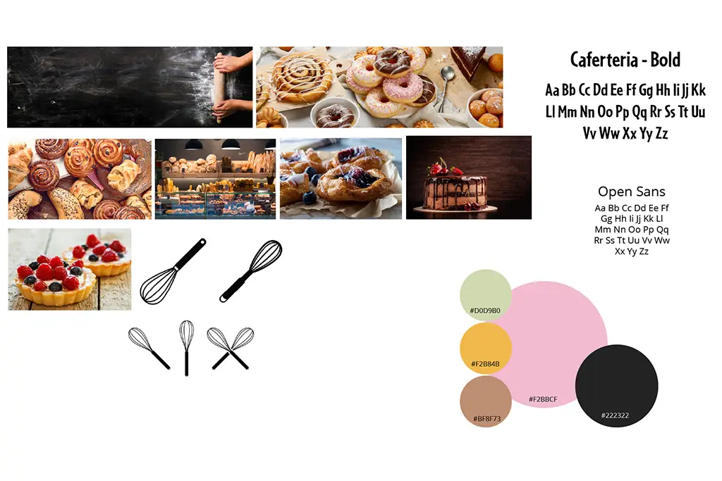
I settled on my top three ideas and created a mood board for each. The purpose of the mood board is to help me get more of an idea of what the site will look. This includes a color palette, fonts, and general images. The mood board is part of the visual research I conduct when designing.
Then I got some feedback from other artists and designers. This helped me solidify my business idea - a local cafe and bakery.
Step 3
In addition to visual research, I also conduct market research. There's a couple of different things I'll investigate for my market research. For this project, I focused on creating User Personas and Competition.
For WhiskTakers, I created four user personas. Personas are imaginary people who I think and want to use this location.
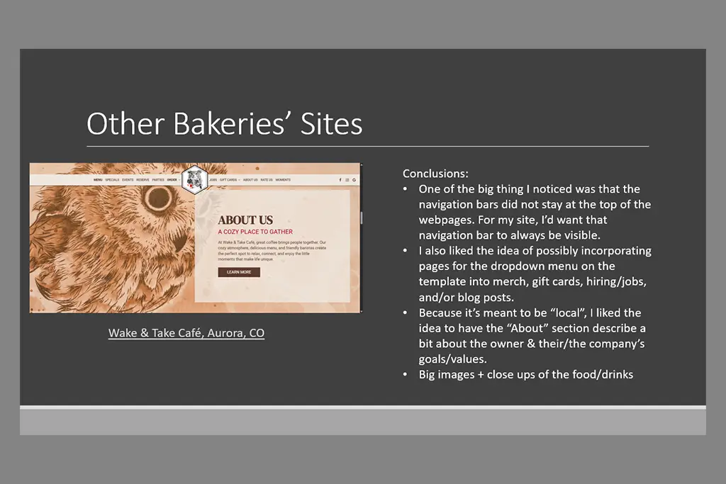
I also spent time browsing other cafes and bakeries both in the Denver area and outside it. I took notes on what I think they were doing well, what could be improved upon, and what I wanted to incorporate for my cafe.
Step 4
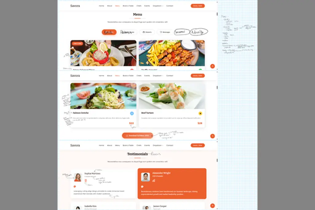
Back to my visual research. Now I spend time creating more detailed notes and sketches on my chosen template. I made notations on what sections I liked, disliked, placements and organization, replacements, color and type changes, images, and other adjustments.
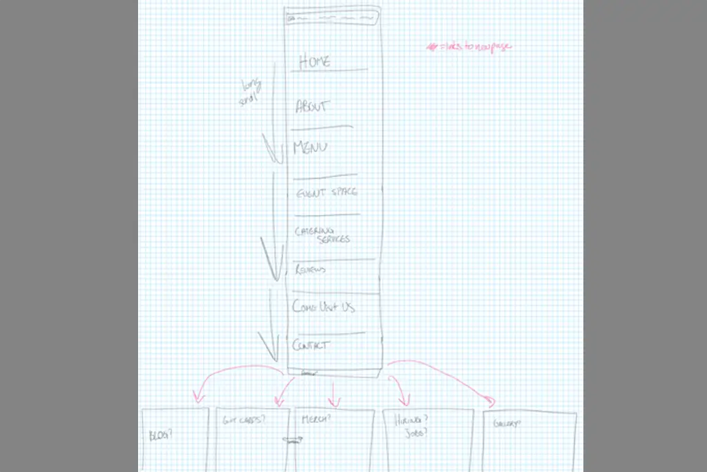
I also created an architecture map for the site. I made a quick layout of the Home page's general format and what additional pages I could access from it.
Step 5
Because I was creating a fictional business, I needed a brand. I began by going back over what I wanted my cafe to be about and what values this company would have.
From there, I began mapping out potential names for the cafe. Once I had a couple I really liked, I moved on to sketch out logo ideas. Once a name and rough logo was chosen, I moved on to developing a final version of it.
At this point I finalized my copy, or the actual words and content I wanted on the site, that I began while sketching and organizing the site's layout.
Step 6
Now it's time to finally put the site together.
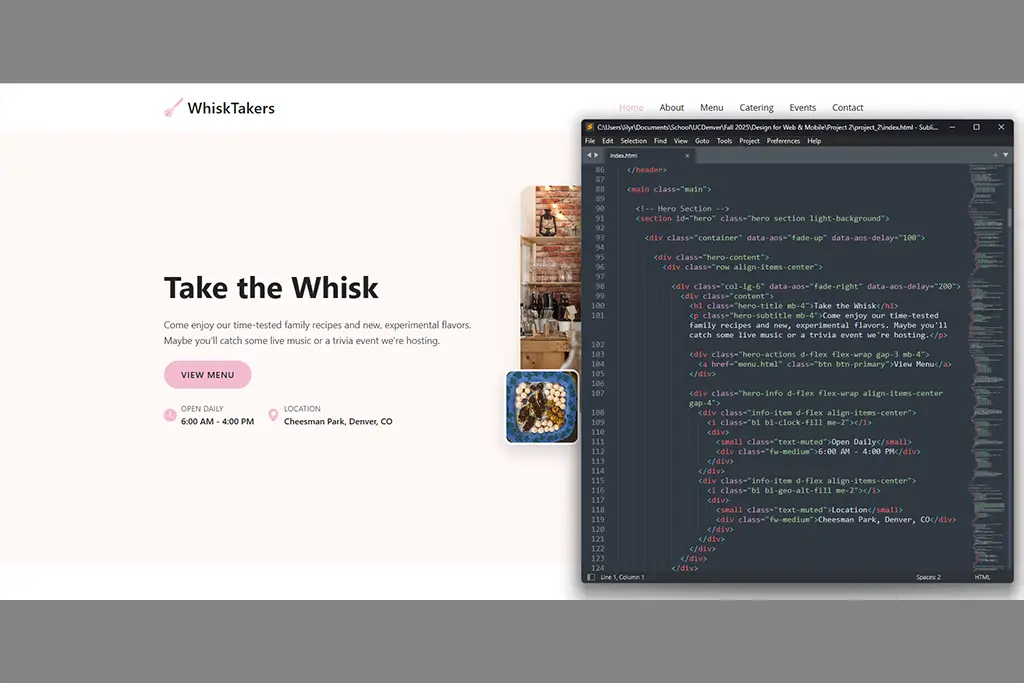
I edited the template's HTML and CSS pages to create WhiskTakers's site. I replaced images using photography of my own baking and other Creative Commons images from Adobe Stock Photos. My chosen color palette was implemented and adjusted as needed. I added my finalized copy.
My very last steps were adding Google Analytics and checking PageSpeed Insights.