Project Details

Dive into the creative process behind each design.

The word "disruption" is at the bottom of the image but the "o" is now a volcano with smoke billowing up and out. There is a light blue background, with black capital letters and a white volcano and smoke.
The word "elimination" in black, lowercase text is centered on a light blue background. White crosshairs focus on the "i"'s dot.
The word "expansion" in black all caps text is centered on a light blue background. The "n" has been transformed into a tower crane, lifting the letter "s" above the other letters.
The word "addition" in black all caps text is centered on a light blue background is stacked above a second copy. The two "t" has been transformed into one plus sign between the words, turning the four "i"'s into two equals signs.
Does this represent disruption to you? What do you think of?
Does this represent elimination to you? What do you think of?
Does this represent expansion to you? What do you think of?
Does this represent addition to you? What do you think of?
Adobe Illustrator
Layout & Magazine
September 2023

Word Experiments

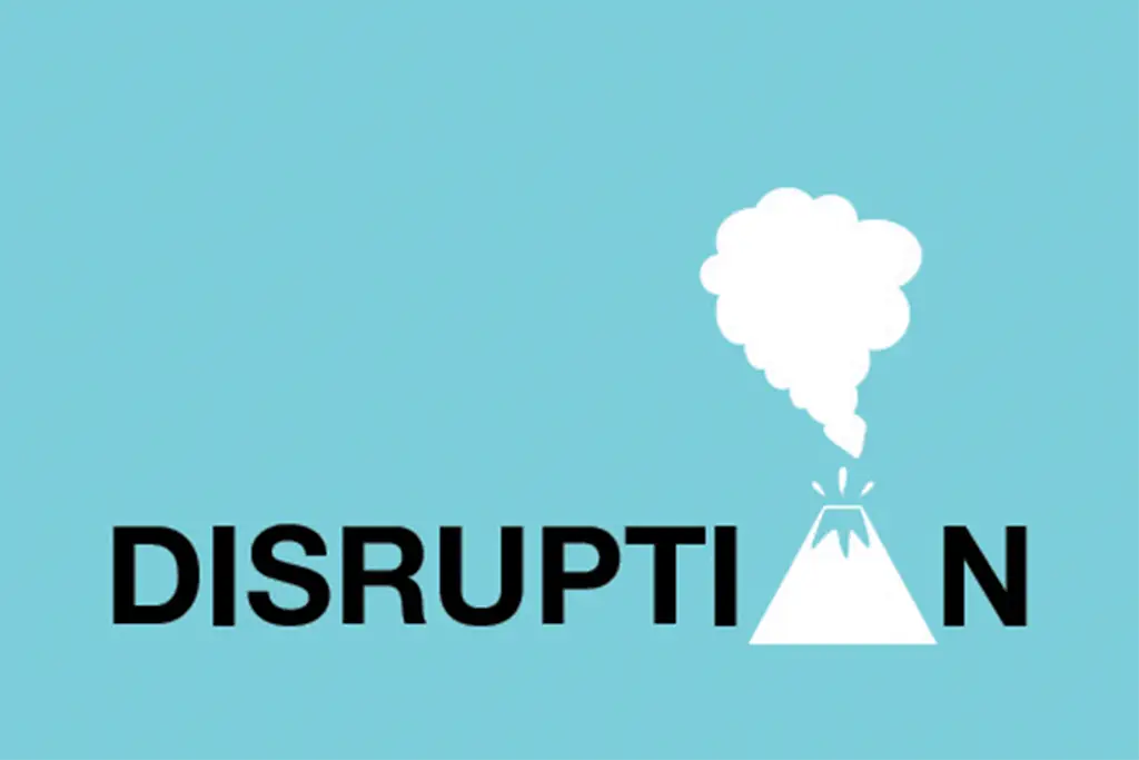
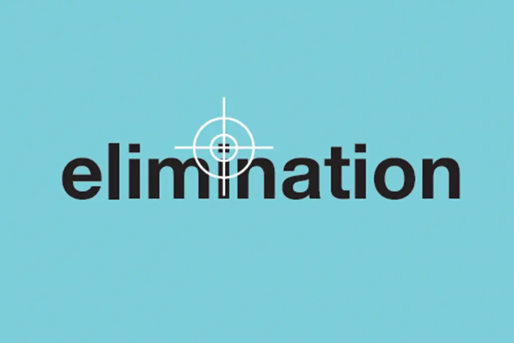
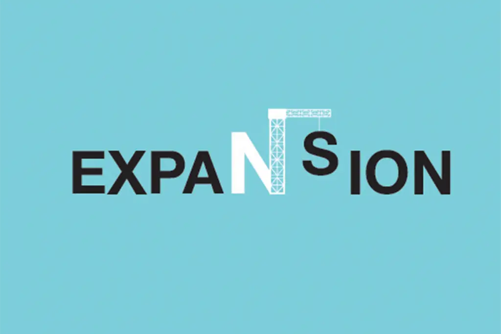
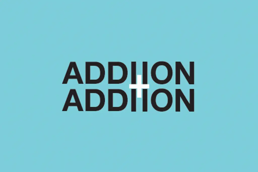
Words have meaning. Often, words have multiple meanings. What do those meanings, either a literal definition or a feeling it invokes, look like? Here's what I think a couple of them could look like. What do you think?

For Typography I, I was assigned a project to visually represent four words from a select list. In the end, I chose "disruption", "eliminate", "expansion", and "addition".

The project came with a few key parameters that needed to be adhered to:

  • No additional words to convey meaning, only the chosen word could appear on each design
  • The design must visually represent some meaning or feeling the chosen word has or invokes

To ensure all four designs worked together, I kept a consistent color palette. To make the visual representations of the words' meanings stand out and speak for themselves they all are visual distinctive from the words themselves.